C.C.
YSDN4003
- Assignment 01
- Assignment 02
- Assignment 03
- Assignment 04
Colin Coulson
213659164
Selected project
Athanasios Sipsis - Rivia
Figma Link
Briefly explain your decision
I chose this project because the topic of reading is very similar to the concept that I proposed for assignment one. I enjoy reading and storytelling and believe it is a valuable form of creativity. Still, it is perceived by many and can become a very daunting task for individuals, turning them away from it entirely.
The target audience that Athanasios Sipsis has chosen for his app is critical to this project. If done correctly, implementing a reward system could be an excellent way of making reading less of a daunting task for children. This is the main reason I have selected this project because the foundation here has a lot of potential to change users' negative perceptions of readings.
Heuristic evaluation
Figma Link
Take away statement
To briefly summarize the heuristic evaluation, the results were that the concept that Thano has created is a strong foundation. The execution of his ideas and presented user scenarios is useful in creating a minimal/efficient experience directed to the app's intended audience. The use of imagery as the predominant form of communication rather than a heavy reliance on text will keep the younger audience engaged and not feel overwhelmed and intimidated.
The user flows represented in the presented wireframes stick to a concise flow that does not tire an inexperienced user, and they all feel easily understood. Due to the shorter user experiences, our group's main pain points were contained within some of the elements in the proposed screens and information that needed further development to communicate the right message to its users effectively.
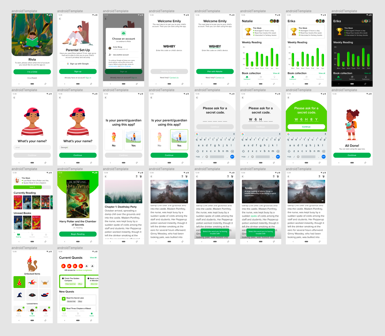
Now to identify the main pain points that we discover while performing our heuristic evaluation. Firstly, it was a collective agreement that the app’s homepage proposed issues to the user and could be managed more effectively. Examples of this are that the book that is currently being read is third under the heading of “Currently Reading” and is indicated at the top with a predominant feature of having it labelled as last read and its quest. This could confuse the user. In my experience, the last read item should be the first item in the list, and this also started the discussion of how many books would be present in this selection. Most users, especially at the reading level of reading Harry Potter, would most likely only be reading one book at a time. Thus, a change in the hierarchy or the organization of items is needed to highlight the current book being read as users will not want to have to hunt for their current book.
The home page also proposes unread books, but there is no option for users to explore or find new books. This heading could be solved with labelling the heading suggested books. More importantly, a library or store feature is needed for the user to search for books that interest them openly, and that is not available at the moment and needs to be implemented.
Within the reading experience, some smaller usability details need to be implemented for the user's benefit. The presented reading method seems to be a long scroll instead of a swipe to page gesture, which could be problematic in navigating long readings, and we believed it should be replaced with the more traditional page and chapter system that would accommodate books of varying lengths. There is also no indicator of the user's location within the book and conflicts with the main quest feature as if users don't know how much they have read or how much they need to read; the user would not feel they are not achieving anything. A progress bar could be an interesting alternative to page numbers as playful methods could be implemented into the progress bar in relation to the given quests to motivate the user.
The final central pain point that we addressed was the identification and differentiation of the quest system. Within our discussion, there emerged a confusion with the reward system and quest system that we believed should have a dedicated form of orientation (Tutorial) to the user, so they understand how the system functions and how they are involved in the experience. This seems to be one of if not the significant user experiences, so all the elements and features need to be easily understood and desirable to the user so effective communication and introduction to its features are necessary.
In conclusion, Thano did an excellent job of developing a concept with strong user experiences and with my corrections and ideas, this can be a very successful project. The next steps that I will be taking in this project are primarily addressing the target audience and age range as this will have a massive influence on the type of reading that the user will be experiencing. Secondly, I believe a lot of time should be put into the reward/quest system of the experience as this is what will give the app longevity and returning users. I will develop an attractive reward system that accommodates different readers, so no user feels excluded or deterred from the given quests. Then I will address the reading experience that creates an environment that adapts and implements the quest goals in a playful manner that intrigues the users to engage further with their reading.